



Some retail kiosks make a great first impression—they are visible from the other end of a shopping mall, drawing people in with lighting, large-scale graphics, and striking structures. However, a problem arises once a customer gets closer: it suddenly becomes unclear what is actually being sold. This is one of the most common mistakes made when designing retail kiosks. An effective display should capture attention from a distance and then encourage a purchase once the customer is up close.
Branding cannot compete with the product
The primary purpose of a retail kiosk is to capture the customer’s attention; its secondary purpose is to sell the product. Yet, many designs stop at the first stage. Designers often focus on a large logo, striking lighting, and an attractive structure—with the result that the product itself becomes the least visible element of the entire display. If it takes a customer several seconds to figure out what is actually being sold at the kiosk, it means the communication hierarchy has been poorly planned. Branding should support the product, highlight its features, and guide the customer’s gaze toward it—never obscure it or draw attention away from it.

The customer first perceives the overall form, and only then the product itself.
From a distance of several meters, what the customer primarily registers is:
- shape of the island,
- dominant colors,
- height of the structure,
- lighting used,
- movement and multimedia elements.
Only after approaching more closely does the customer begin to analyze the products, prices, and details of the offer. For this reason, the design of a retail island should guide the customer through a series of stages. First, the island captures attention. Next, it introduces the brand. Finally, it presents the product in a way that is clear, accessible, and encourages interaction. If all these elements compete for attention simultaneously, the customer will not know where to focus. As a result, they may end up ignoring the entire display.
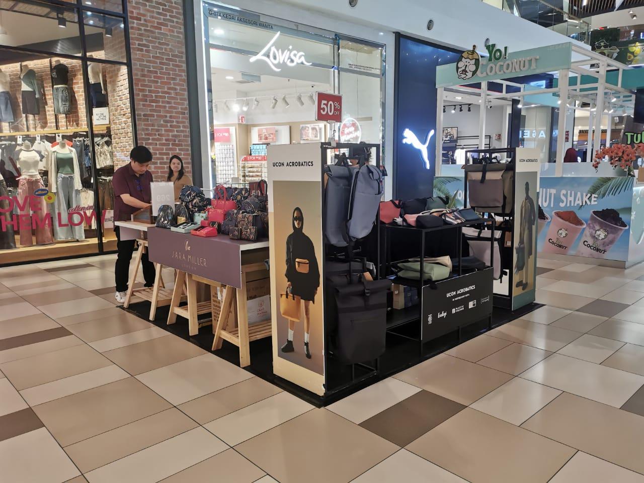
The product should be available without a second thought.
Even a highly visible product will not sell effectively if the customer cannot easily examine it, touch it, or pick it up. Products are often displayed by:
- too high,
- too low,
- too deep,
- behind glass,
- behind a screen,
- behind decorative elements,
- beyond the customer’s natural reach.
The result is simple: the customer looks at the display island but does not engage with it in any way. An effective display encourages the customer to reach for a product naturally—without needing to ask staff for help, search for the right shelf, or walk all the way around the structure. The less effort it takes to explore the selection, the greater the likelihood that the customer will become interested in the product and decide to make a purchase.
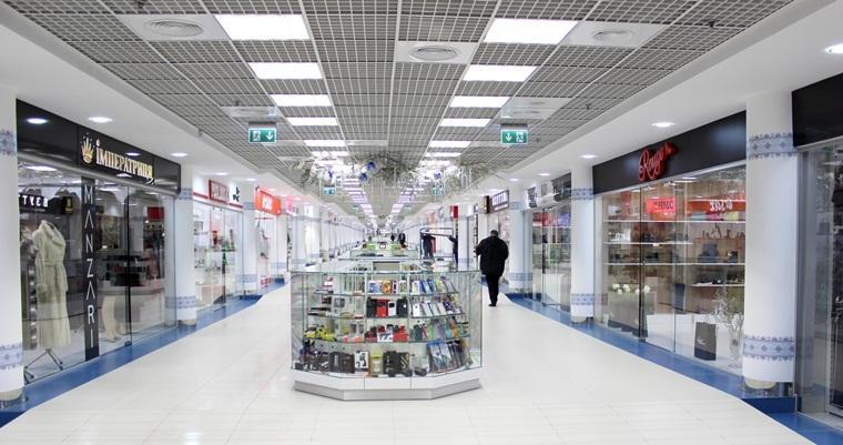
Too many messages mean no message at all
On many retail kiosks, you can find all of the following at once:
- brand logo,
- campaign name,
- promotional information,
- product price,
- QR code,
- product description,
- a few advertising slogans,
- lifestyle imagery,
- information about additional benefits.
Each of these elements may be necessary. However, they should not all occupy the same level of communication or compete for the customer’s attention. The most important message must be immediately visible. Other information should be revealed gradually—depending on the customer’s distance from the island and their level of interest. A well-planned hierarchy of information is just as important as the design of the unit itself.
Lighting should showcase the product, not just the island.
Lighting has a profound impact on how a customer perceives a display. It can highlight key products, draw the eye toward a specific shelf, and accentuate details on packaging. Conversely, poorly chosen lighting can also:
- cause reflections on screens and glass surfaces,
- alter the colors of products,
- create unsightly shadows,
- illuminate the fixtures rather than the merchandise,
- glare into the eyes of customers walking past the display island.
Therefore, lighting should be designed in conjunction with the product layout. It should not be merely a decorative addition to a completed structure.
Can the product be seen from every direction?
Most retail islands are located in an open space. A customer can approach the display:
- from the front,
- from the back,
- from the left side,
- from the right side,
- diagonally.
Each side of a retail island should therefore serve a specific function. Branding, products, and messaging must remain clear, regardless of the direction from which a customer approaches. Some designs may look striking in a visualization created from a single angle, yet in an actual store, it often turns out that certain products are hidden, obscured by the structure, or inaccessible to customers. For this reason, the design of a retail island should be analyzed in a full 360° scope, taking into account every possible direction of customer traffic.
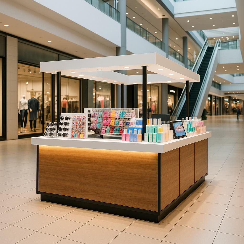
The island must also be comfortable for the staff.
An effective retail kiosk should be convenient not only for customers but also for the staff operating it. During the design process, the following should be taken into account:
- space for storing additional stock,
- easy access to inventory,
- convenient product replenishment,
- space for sales materials,
- an ergonomic workstation,
- access to a power supply,
- the ability to quickly clean the display area,
- good visibility for customers from every side.
If staff have difficulty restocking products or are forced to obstruct the display while working, the kiosk quickly loses its aesthetic appeal and ceases to be an effective sales tool.
Common mistakes in the design of retail kiosks
Among the most frequent issues are:
- overly dominant fixtures,
- products that are invisible or poorly lit,
- lack of a communication hierarchy,
- an excess of text and graphic elements,
- inappropriately chosen lighting,
- difficult access to products,
- lack of ergonomic working conditions for staff,
- poor visibility from certain angles,
- insufficient space for restocking merchandise,
- a design created solely for the sake of an attractive visualization, rather than for an actual store.
overly dominant fixtures,
products that are invisible or poorly lit,
lack of a communication hierarchy,
an excess of text and graphic elements,
inappropriately chosen lighting,
difficult access to products,
lack of ergonomic working conditions for staff,
poor visibility from certain angles,
insufficient space for restocking merchandise,
a design created solely for the sake of an attractive visualization, rather than for an actual store.
- Is it immediately clear what product is on the island display?
- Is the product visible from every direction?
- Can the customer easily reach the product?
- Is the key message legible?
- Is the price displayed in a visible location?
- Does the lighting highlight the product?
- Can staff easily restock the display?
- Does the structure obstruct the flow of customer traffic?
- Does the island display still look good when only partially stocked?
Answering these questions makes it possible to identify many issues even before a prototype is built. This helps avoid costly changes once production begins or the display is installed in a store.
Summary
Designing a retail kiosk goes beyond creating an attractive visualization. The most effective displays guide the customer through the entire journey—from noticing the kiosk from a distance and developing an interest in the brand, to easily interacting with the product and making a purchase decision. A well-designed kiosk should capture attention while ensuring the product remains the star of the show. Branding, structural design, lighting, and communication must all work in tandem to drive sales. At UC POS, we design and manufacture retail kiosks, promotional islands, and branded zones that not only look great but, above all, boost sales. We integrate conceptual design, structural engineering, ergonomics, prototyping, and in-house production. This approach allows us to eliminate potential issues—the kind that often arise during implementation—as early as the design phase.
Before creating an island, verify its effectiveness
Do you already have a design for a retail island, or are you currently planning a new display? At UC POS, we design and manufacture retail and promotional islands for brands across the FMCG, beauty, retail, and premium sectors. Before production begins, we analyze product visibility, ergonomics, brand messaging, and the overall functionality of the structure. Send us your concept or brief; we will conduct a design audit and show you how to enhance its effectiveness within an actual retail environment.