


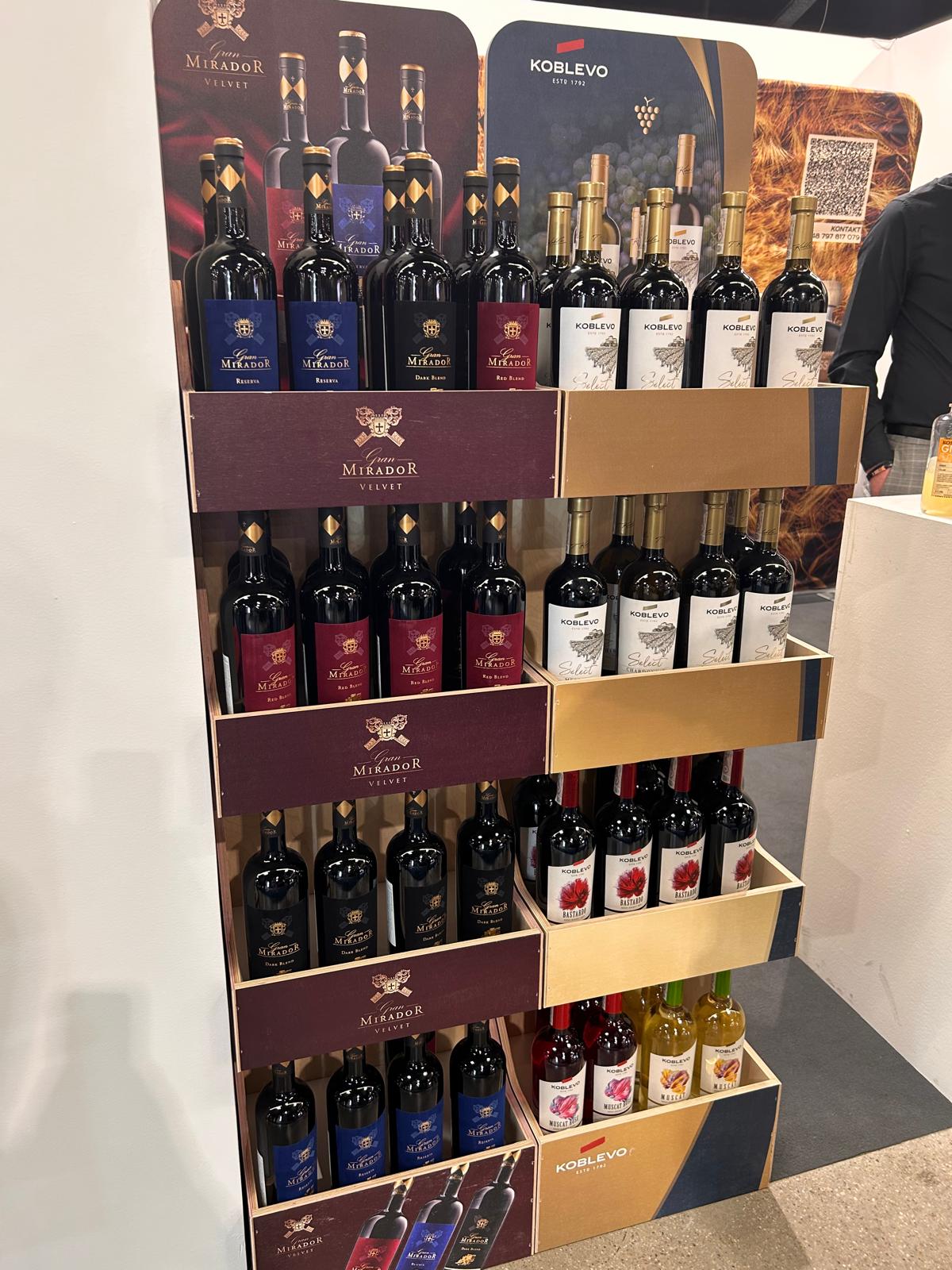
Everything looks perfect on the render.
6 products fit perfectly.
The label is visible.
The front branding looks clean.
The brand is happy.
And then the final bottle arrives.
Slightly wider.
Slightly taller.
With a different label.
With a larger neck.
With a different positioning angle.
And suddenly:
👉 instead of 6 products, only 5 fit
👉 the branding disappears behind the front strip
👉 the product is no longer clearly visible
👉 the entire display looks different from the original project
This is one of the most common problems in POS production for FMCG and alcohol brands.
Why do POS projects stop matching reality?
A POS project is often created before the final product itself is ready.
The brand is still working on:
- packaging,
- labels
- bottle shape,
- caps,
- product positioning.
Meanwhile, retail and production already require exact dimensions.
And this is exactly where problems begin.
1. The final bottle is different from the original project
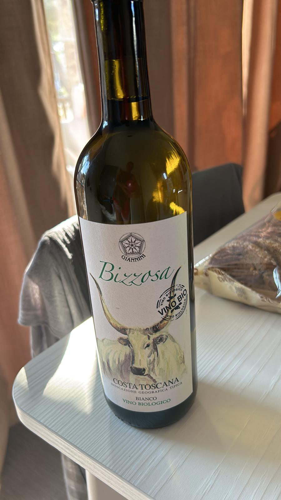
This is a classic issue in alcohol display projects.
At the concept stage:
- visualizations are used,
- mockup,
- old bottles are referenced,
- or technical samples are used.
And later:
👉 a new product version appears
Suddenly:
- the label disappears behind the front panel,
- the bottle neck sticks out too high,
- the branding is no longer visible.
In retail, just a few centimeters can make a massive difference.
2. The display was designed for different product dimensions
We experienced situations where:
- the display was designed for 6 bottles,
- but the final bottle shape became wider,
- which physically reduced the capacity to only 5 products.
The render looked perfect.
But in real retail:
👉 facings change,
👉 display capacity changes,
👉 sales performance changes.
And suddenly the entire business case looks completely different.
3. Branding disappears because the front strip is positioned incorrectly
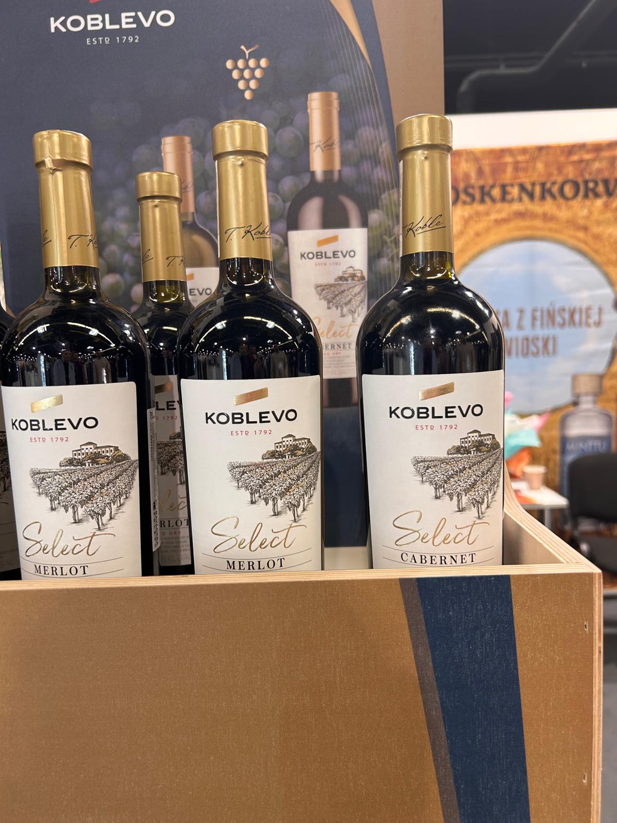
This is a very common issue in premium alcohol displays.
The display design looks great:
- strong branding,
- elegant structure,
- premium construction.
But:
👉 the front strip hides the product name,
👉 customers cannot see the label,
👉 the key sales element disappears.
And in wine retail:
- labels,
- bottle shape,
- premium cues
often sell the product themselves.
4. Renders do not show real product behaviour in-store
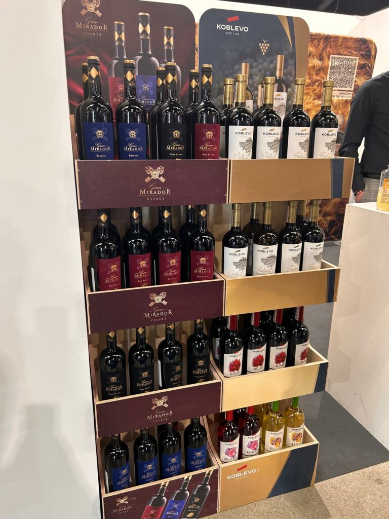
On the render:
- everything is perfectly aligned,
- the product positioning is ideal,
- lighting is fully controlled.
In-store:
- bottles are moved around,
- products rotate,
- customers place them back differently,
- lighting behaves completely differently.
That is exactly why retail solutions need to be tested in practice.
5. Alcohol POS displays require category thinking, not only design thinking
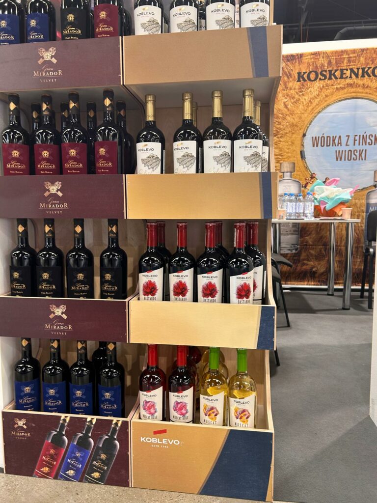
When designing displays for:
- wine,
- spirits,
- premium FMCG, it is not only aesthetics that matter.
What matters is:
- product visibility,
- ease of product replenishment,
- label readability,
- product stability,
- store ergonomics,
- customer behaviour at shelf level.
Because ultimately, the display should:
👉 sell,
not only look good in presentations.
Experience from a real project
During one of our recent meetings with a client, we laughed because both sides had experienced almost identical situations.
In one project:
👉 the front strip covered the label.
In another:
👉 the display was designed for 6 products but finally fitted only 5 because the bottle dimensions changed.
These are exactly the kinds of situations that are almost invisible at the rendering stage.
But later they directly affect:
- sales,
- logistic,
- merchandising,
- and overall product perception in-store.
That’s why, in FMCG and alcohol POS projects, testing the real product as early as possible is so important.
How to avoid these problems in POS design?
• test the final product before serial production,
• design based on real bottle dimensions,
• consider multiple packaging variations,
• verify label visibility on the physical product,
• involve the POS manufacturer already at the concept stage,
• create quick prototypes and category visibility tests.
Summary
In premium retail and FMCG, major changes rarely decide the final result.
Details do:
- a few millimeters of width,
- front strip height,
- label proportions,
- product positioning angles.
Designing a POS display for alcohol brands or FMCG?
At UC POS, we design and produce retail displays adapted to real products, real store conditions and real retail rollouts.
We support brands and agencies at every stage of the process – from POS display design, prototyping, and structural optimization to product testing and full retail implementation. We produce permanent POS displays, retail furniture, custom display solutions, and premium retail displays for the FMCG and alcoholic beverage industries.