


The customer is already at the checkout. He has his phone in one hand and his wallet in the other. His mind is already outside the store.
This is the precise moment when a countertop display needs to do its job. There isn’t a minute to spare. Not even ten or fifteen seconds. Usually, there are fewer than three. That is why an effective checkout display doesn’t try to tell the brand’s entire story; instead, it aims to convey a single, simple message and prompt the customer to reach for the product instinctively.
At the checkout, the customer doesn’t want to think.
The checkout area operates differently from the rest of the store. Here, decisions are quick and often unplanned. That is why a checkout display should answer one question:
Why is it worth choosing this product right now?
There is no room here for long descriptions. There is no room for complex graphics. What works best is:
- one benefit,
- one photo,
- one call to action,
- easily accessible product.

First the product. Only then the advertising.
Designers often try to cram too much information onto a small display. The result? The customer doesn’t know where to look. A good point-of-sale display guides the eye in exactly this order:
- product,
- advantage,,
- price or promotion,
- brand.
The customer sees the advertisement first instead of the product, and the likelihood of a purchase decreases.
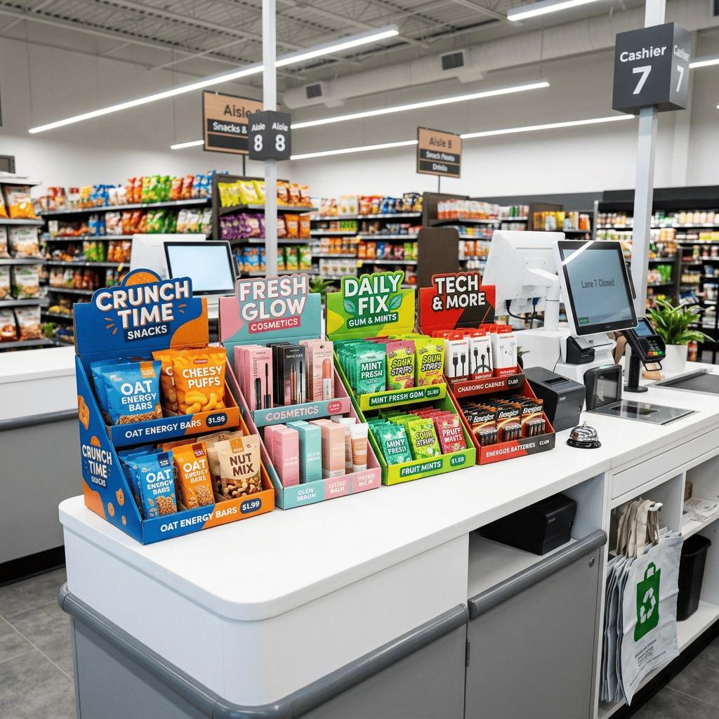
The product must be available without a second thought.
Every additional step reduces the likelihood of a purchase. If the customer has to:
- open the flap,
- move other products,
- aim too high,
- rotate the packaging,
…very often simply gives up. That is why we design displays so that the product can be picked up with a single, natural hand movement. It is a seemingly minor detail that has a huge impact on sales.
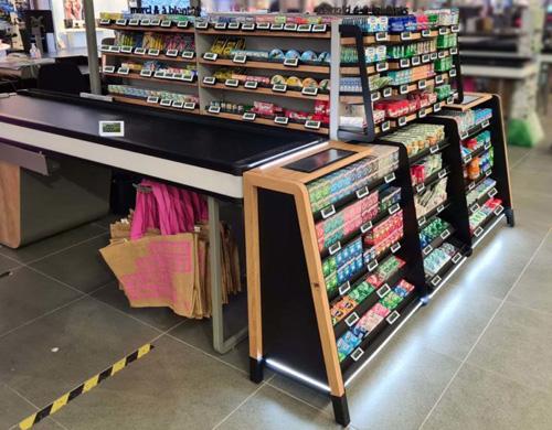
A good message consists of just a few words at most.
A checkout display does not replace an advertising campaign. Its purpose is to remind customers of the product. Messages such as the following work best:
- Novelty,
- Bestseller,
- Last one,
- try
- perfect for…
- take it with yourself,
The shorter the message, the sooner it will be noticed.
The display should work in harmony with the store space.
There are many elements at the checkout that distract attention:
- payment terminal,
- POS screen,
- bags,
- promotional materials,
- a queue of customers.
Therefore, the display unit must stand out in terms of form without interfering with the service process. The best solutions are designs that blend naturally into the counter space and remain clearly visible from various angles.
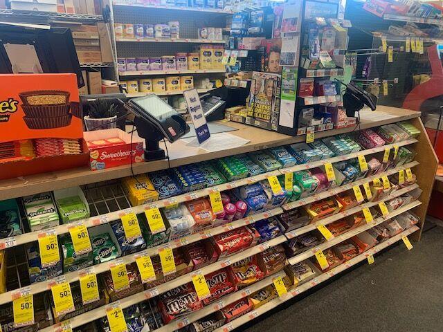
The display should always be fully stocked. Customers are far more likely to reach for a product when the display looks neat and well-stocked. Empty spaces, toppled packaging, or outdated graphics detract from the value of the entire display. Therefore, it is worth considering the following at the design stage:
- rapid addition of products,
- simple replacement of graphics,
- easy cleaning,
- durable materials resistant to everyday use.
It is precisely such details that ensure the display performs just as effectively on the first day after implementation as it does on the hundredth.

Summary
A good point-of-sale display doesn’t sell simply because it is eye-catching; it sells because it conveys the right message at the right moment. In the checkout area, simplicity, product accessibility, and clear communication are what matter. If a customer has to stop and think, you’ve usually already lost the sale. If they know exactly what to do right away, the likelihood of a purchase increases.
At UC POS, we design, prototype, and manufacture POS displays made from metal, wood, MDF, acrylic, plastics, and cardboard. Right from the conceptual stage, we analyze ergonomics, structural stability, and in-store placement to ensure the display is safe, durable, and effective at driving sales.
Do you have a product that should sell at the checkout?
Send us the product or a brief outline. We will design a countertop display tailored to customer behavior, available space, and store operations. We will develop the concept, select the materials, and propose a solution ready for implementation.